PROBLEM
The current application faces two usability challenges that could impact user adoption. Its outdated visual design risks disengaging potential users, and new users struggle to navigate and understand the features without guidance. Because of the application’s complexity, users experience high cognitive load, making it harder to quickly understand how it works and gain value from it.
ROLE
Led the end-to-end redesign of the application, independently managing timelines and workload to deliver the project on schedule. I collaborated closely with the front-end developer to ensure the final build aligned with the design, and oversaw QA to deliver a polished outcome.
CONSTRAINTS
Worked to a tight timeline, as the company wanted the redesign delivered as quickly as possible. This meant there was limited time for refinement, and at times I had to move forward with the best available solution rather than perfecting every detail.
Had to balance stakeholder and developer expectations, which was sometimes challenging because they didn’t always understand effective UI. I often had to spend time explaining why certain design requests weren’t ideal, which occasionally took time I couldn’t afford.
IMPACT
1
Enabled a shift in onboarding from feature-heavy explanations to understanding how the product fits together, reducing onboarding time by 50%, from one hour to 30 minutes.
2
Features are more intuitive, allowing 85% of users to easily grasp the basics of the application and understand where everything is located.
3
A modernised interface that increased customer retention by 15%, driven by improved navigation and a more appealing look and feel.

FINAL DESIGN WALKTHROUGH
MY REDESIGN PROCESS
So what was my process...
PROBLEM AREAS
Focused on solving these 2 problem areas to achieve success.
1
Outdated Design
The application's existing visual style is outdated, which risks disengaging potential users.
2
Poor Usability / High Cognitive Load
New users may struggle to quickly understand the application’s functionality due to its complexity, making it difficult to use its features without guidance.

MOOD BOARD
Created a mood board to gather inspiration and explore design concepts for the redesign, helping me stay current with trends while avoiding design mistakes from previous versions.


WIREFRAMES / HIGH FIDELITY DESIGNS
Created multiple design iterations, addressing issues and incorporating feedback as they arose. Arriving at a final design that satisfied the team while effectively solving the identified problem areas. This project was on a tight timeline which meant no user feedback on the application and less time for iterations. Which is why designs were only changed depending on my reflections and team feedback.
The base design of the application is used to illustrate this process.
A curated selection of images has been chosen to provide a snapshot of the collected visuals.
ORIGINAL APPLICATION REFERENCE
FEEDBACK / REFLECTION
-
Design felt overcrowded, with too much happening in one space.
-
The status dropdown and action buttons are grouped together despite serving separate functions.
DECISIONS I MADE
1

1
Refined the layout to display more of the table without requiring excessive scrolling.
2
Improved button clarity by adding labels, so users can understand their function at a glance.
-
Having two bar panel sections side by side is not functional, as the system cannot retrieve information from them in that format.
-
Most Main action buttons can be integrated into the table rows to reduce the number of clicks required to complete tasks.
-
Buttons in the right bar panel should be displayed differently, as the options change depending on the page.
FEEDBACK / REFLECTION
DECISIONS I MADE
2

1
Increased whitespace between elements to reduce cognitive load.
2
Grouped elements more logically to improve clarity and usability.
3
Updated UI components and spacing to create a more modern and visually cohesive interface.
-
The design needs further compression to allow users to view more of the table without scrolling.
-
Filters can be removed, as they will be integrated directly into the table.
-
The search bar should be moved closer to the table, as it is the primary tool users use to navigate table contents.
FEEDBACK / REFLECTION
DECISIONS I MADE
3

1
Repositioned buttons below to ensure the system can properly retrieve the required information.
2
Removed most of the main action buttons to table rows, reducing on-screen clutter.
DECISIONS I MADE
Final Design
1
Condensed the design to display more table rows at once, allowing users to see more information at a glance.
2
Moved the search bar above the table to make it easier for users to navigate its contents.
3
Moved right bar panel buttons outside of the white bar to indicate they impact the page differently.
3
Changed around colours to create a brighter design and make key features more prominent.
.png)
How I would approach this project differently next time:
01
Leverage AI to inspire stronger design ideas, enhancing my work while uncovering concepts I might not have considered on my own.
02
Prioritise accessibility in my designs. Early in my career, accessibility sometimes gets overlooked, but as I grow as a designer, I aim to make thoughtful decisions that ensure my work is usable for everyone.
LESSONS & GROWTH
Key lessons from this project:
01
Navigating the challenge of letting go of designs I care about to satisfy stakeholder and manager needs.
02
Learned the importance of mood boards, especially when the design direction is unclear. While I aimed for a simple, modern interface, I initially lacked a clear starting point. Creating visual inspiration not only helped guide my own thinking but also aligned the team early on, allowing us to agree on a direction upfront and save time later in the process.
03
Gained a deeper understanding of strong project management while redesigning the entire application. By breaking the work into clear sections, I was able to manage the scope effectively, stay organised, and feel well-prepared throughout the process.
BRAND GUIDE
The FlowEnso brand identity was derived from the meaning behind its name.
“Flow” represents movement and continuity, while “Enso” references the Japanese symbol of enlightenment, strength, and elegance. This duality informed a fluid, organic logo form paired with a refined colour palette, resulting in a more expressive and contemporary visual identity that elevated the brand beyond its original aesthetic.
LOGO SET
Primary Logo

Secondary Logo & Favicon
TYPOGRAPHY
H1 Satoshi - Bold 40px
AaBbCcDdEeFfGg
Subheading Plus Jakarta Sans - Medium 16px
AaBbCcDdEeFfGgHhIiLlJj
Body Satoshi - Regular 14px
AaBbCcDdEeFfGgHhIiLlJj
COLOUR PALETTE
RUBY
RGB 247 / 147 / 0
HEX #D94016
BORDEAUX
RGB 153 / 33 / 53
HEX #992135
CLOUDY
RGB 196 / 214 / 214
HEX #C4D6D6
MARINA
RGB 0 / 63 / 84
HEX #003F54
BACKGROUND


SOCIAL MEDIA - LINKEDIN
Goal:
Develop and produce LinkedIn content to launch FlowEnso’s social media presence and attract potential users.
Outcome:
Drove traffic to our website, increased user engagement, and helped position FlowEnso as a credible Logistics SaaS platform. This was done by showcasing product features and solutions, by raising awareness among target users that there was a new, practical option to simplify their logistics workflows.
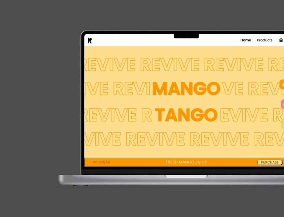
WEBSITE
Goal:
Build FlowEnso’s website on Wix, creating a clear and engaging overview of the products features and pricing to help users quickly understand the product.
Outcome:
Delivered a brand-aligned website that clearly communicated all essential information in 4 weeks. In addition, implemented automated sign-ups and demo bookings to streamline the user journey, strengthen the company’s professional image, and simplify the capture and management of user interest.
Please note information has been removed for privacy reasons.

PROJECT MANAGEMENT
Situation:
Task completion across the team was low, with limited visibility into individual workloads, making effective task allocation difficult as messages in Teams were often missed or overlooked.
Solution:
Implemented and managed Asana to help improve team efficiency and task visibility.
Outcome:
Task completion rose to 95%, while the time I spent reiterating instructions significantly decreased, improving overall team efficiency and productivity. I consistently managed Asana throughout my time at the company, helping the team prioritise effectively and focus on high-impact tasks. Reducing tasks taking 3+ days to complete to 1 day.


Please note information has been removed for privacy reasons.
Walk Through


_gif.gif)
